Python Matplotlib
2023-12-12
筆記使用 Python 藉由 Matplotlib 繪製地圖 (Map) 與分佈點 (Scatter) 的方式。
說明
 GitHub
Basic Figure Setup
# Importing the pyplot module from matplotlib for plotting graphs.
import matplotlib.pyplot as plt
# Importing the matplotlib library.
import matplotlib

             #y1    #x1      #y2    #x2
             #0 0   #0 1     #1 0   #1 1
mainland = ((32441, 32062), (34301, 33532))

dpi = 72

# Setting the font family to 'Microsoft JhengHei' for all plots. This font is often used for Chinese characters.
matplotlib.rcParams['font.family'] = 'Microsoft JhengHei'

# Setting a variable 'displayRatio' to 0.3, which for scaling the plot dimensions.
displayRaio = 0.3

# Calculating the x-axis and y-axis length for the plot, scaled by 'displayRatio'.
x_length = (mainland[1][1] - mainland[0][1]) * displayRaio
y_length = (mainland[1][0] - mainland[0][0]) * displayRaio

# Creating a figure and an axes object with custom size.
# The size is determined by the previously calculated x_length and y_length,
# converted from pixels to inches (since 72 pixels = 1 inch).
fig, ax = plt.subplots(figsize=(x_length / dpi, y_length / dpi), dpi = dpi)

# Adjusting the subplot parameters to expand the plot to the full extent of the figure area.
fig.subplots_adjust(left=0, right=1, top=1, bottom=0)

# Adding a text (probably a title or caption) to the figure.
# The position, font size, and background box properties are customized.
fig.text(0.5, 0.006, f'圖片標題', ha='center', va='bottom', fontsize= 18, bbox=dict(facecolor='lightgray', alpha=1))

# Setting the limits for the x-axis and y-axis based on the 'mainland' coordinates.
ax.set_xlim(mainland[0][1], mainland[1][1])
ax.set_ylim(mainland[0][0], mainland[1][0])
這次處理的資料特色是 (y, x) 形式的資料儲存方式,而非常見的 (x, y)。
需要注意的是因為 figsize 是使用 inch 為單位,如果要對照為 pixel,必須使用 pixel 除以 dpi 的方式去做轉換 DPI & Pixel Converter。
Subplot Function
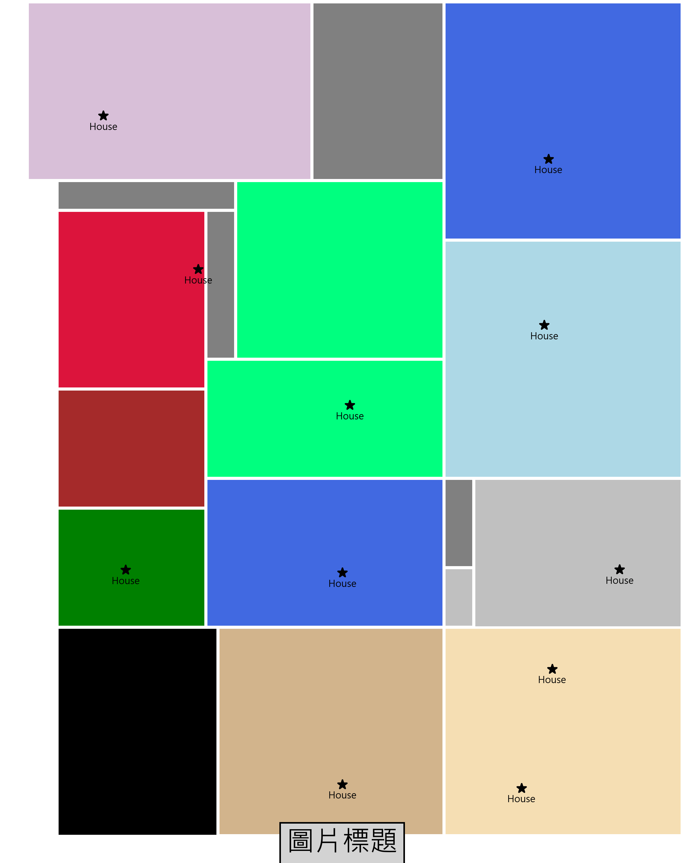
def draw_square(ax, p1, p2, color='black', name = ''):
    y1, x1 = p1
    y2, x2 = p2 - 10  # Subtract 10 from both coordinates of p2

    # Create a rectangle with the given points, color, and no fill
    width, height = abs(x2 - x1), abs(y2 - y1)
    square = plt.Rectangle((x1, y1), width, height, fill=True, color=color)
    ax.add_patch(square)

    # Positioning the name label above the center of the square
    label_pos = ((x1 + x2) / 2, y2 - 20)
    ax.text(*label_pos, name, ha='center', va='center', fontsize=10)
Sample Data
area = {
    'area1': ((32516,32195), (32961,32531), 'black', True),
    'area2': ((32513,33024), (32965,33532), 'Wheat', True),
    'area3': ((34062,33051), (34016,32944), 'red', False),
    'area4': ((32511,32531), (32963,33024), 'Tan', True),
    'area5': ((32966,32199), (33212,32517), 'green', True),
    'area6': ((32966,32518), (33281,33027), 'royalblue', True)
}

storehouse = [
 (32613,32801, 'Alice', 'area4'),
 (32741,32444, 'Bob', 'area1'),
 (33070,32339, 'Charlie', 'area5'),
 (33076,32808, 'Dave', 'area6'),
Darw
for name in mapData.area.keys():
    draw_square(
        ax,
        mapData.area[name][0],
        mapData.area[name][1],
        color = mapData.area[name][2],
        name = '')

for w in mapData.storehouse:
    plt.scatter(w[1], w[0], s= 36, color='black', marker='*')
    ax.text(w[1], w[0] - 25, 'House', ha='center', va='center', fontsize=6)
Save Image
# Defining the filename for saving the plot.
filename = f'maplotlib_output.png'

# Turning off the axis (no ticks or labels).
plt.axis('off')

# Saving the plot to a file with a high resolution (5 times the DPI).
plt.savefig(filename, dpi = dpi * 5)