超簡單學習 Vue.js 系列 | Vue-Toys-Converter
2022-02-12
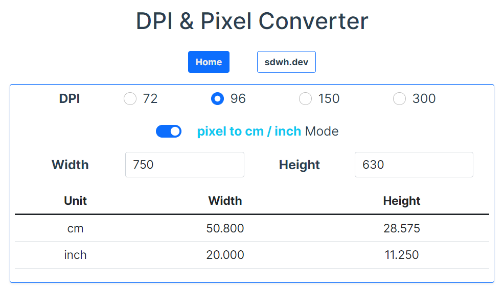
Vue.js 簡單的示範專案,使用 Vue CLI 實作將所學習的知識以及實作需要的功能,藉此將知識實際結合,記得牢、想得到、用得出來。本次藉由 Vue Two Way Binding 實作轉換長寬,由公分 (cm) 或者英寸 (inch) 到網頁圖片經常使用的 pixel。
數值轉換器 Vue Converter
 GitHub
 Demo
Demo
| 技術關鍵字 | 說明 |
|---|---|
| Horizon Input Groups | |
| Switch Button | |
| Two way Binding |
App.Vue Padding
為了讓行動裝置的檢視畫面能夠跟邊距稍微保持距離,在 App.Vue Component 中使用全域的 CSS 對 Padding
#app {
  padding: 10px;
}
Form
Converter 有 DPI、Width 以及 Height 的輸入參數,因此使用 form tag 將相關的 ipunt tag 整理在一起。
每一個 input 使用 Div 包住,並且加上 mb-3 作為垂直距離留白,並在按 input 都需求加入 d-flex、justify-content-evenly 或 flex-wrap 來進行排版。
<div class="mb-3 d-flex justify-content-evenly flex-wrap">
  ...
</div>
Horizon Radio Buttons
水平排列的 Radio Input Tag,藉由外層的 d-flex 來排版 label 與 input。此外各 Radio Input 藉由 Vue v-for 的方式渲染,寫起來清爽也方便。
在 input 使用 v-model 的方式,綁定 data 中的 dpi,只要點選就會將 value 賦予給 dpi,必須要注意各 Radio Input 必須要保持 name 不重複。
同時在 checked 使用 Vue bindind 設定預設勾選 dpi 為 96 的 Radio Input。
<div class="mb-3 d-flex justify-content-evenly flex-wrap">
  <div>
    <label for="DPIRadio" class="form-label fw-bold">DPI</label>
  </div>
  <template v-for="i in dpiRange" :key="i">
    <div class="form-check form-check-inline">
      <input
        class="form-check-input"
        type="radio"
        v-model="dpi"
        :name="'radio_dpi_' + i"
        :id="'radio_dpi_' + i"
        :value="i"
        :checked="i === 96"
      />
      <label class="form-check-label" :for="'radio_dpi_' + i">{{i}}</label>
    </div>
  </template>
</div>
Switch Button
Swithc Button 讓 Form 的互動更為活潑,且 Bootstrap 5 原生就支援 Active 的顯示非常方便,只要藉由 v-model 綁定 data 中的 boolean 即可。
搭配 js ternary operator,根據 v-model 綁定的 data 來決定 label 顯示目前使用中的 Mode。
<div class="mb-3">
  <div class="d-flex justify-content-center">
    <div class="form-check form-switch">
      <input class="form-check-input" type="checkbox" id="px2cmiSwitch" v-model="px2cmi">
      <label class="form-check-label mx-3" for="px2cmiSwitch">
        <span class="text-info fw-bold">
          {{ px2cmi === true ? 'pixel to cm / inch' : 'cm / inch to pixel'}}
        </span> Mode</label>
    </div>
  </div>
</div>
Text Input
放大與加粗 label 的文字顯示,此外在 input 使用 w-25 設定 width。
<div class="mb-3 d-flex justify-content-evenly align-items-center">
  <label for="c-width" class="col-sm-2 col-form-label fw-bold">Width</label>
  <div class="w-25">
    <input type="number" class="form-control" id="c-width"
      style="font-size:20px" v-model="width_input"/>
  </div>

  <label for="c-height" class="col-sm-2 col-form-label fw-bold">Height</label>
  <div class="w-25">
    <input type="number" class="form-control" id="c-height"
      style="font-size:20px" v-model="height_input" />
  </div>
</div>
Components
從 Home.vue 到 ConvertedTable.vue,藉由 js object 的方式,將資料傳入 props 入 Converted.vue,分別傳入了多個值,但也可以考慮以 vhWrapper 的方式,改用大 wrapper 或者是 plain object class object 的觀念用單一物件傳入。
Home.vue
<ConvertedTable
  :px2cmi="px2cmi"
  :whWrapper="{width: width_input, height: height_input}"
  :dpi="dpi"
  :inchToCm="inchToCm"
/>
import ConvertedTable from '@/components/ConvertedTable.vue'
export default {
name: "Home",
data() {
return {
dpiRange: [72, 96, 150, 300],
dpi: 96,
inchToCm: 2.54,
height_input: 1080,
width_input: 1920,
px2cmi: true
}
},
components: {
ConvertedTable
}
};ConvertedTable.vue
props 接入了傳入的 data。
export default {
  props: ["px2cmi", "whWrapper", "dpi", "inchToCm"]
}
table 的使用一定要注意要使用 thead 以及 tbody Boostrap 預設的 Table Style 才會美觀。
使用 v-show 根據 props 中的資料判斷是否顯示特定資料列,沒有使用 computed,直接在 table cell 中進行運算結果的呈現 (因為沒有要重複使用)。
<table class="table" style="font-size:20px">
    <thead>
      <tr class="border-primary">
        <th>Unit</th>
        <th>Width</th>
        <th>Height</th>
      </tr>
    </thead>
    <tbody>
      <tr v-show="px2cmi">
        <td>cm</td>
        <td>{{ (whWrapper.width / dpi * inchToCm).toFixed(3) }}</td>
        <td>{{ (whWrapper.height / dpi * inchToCm).toFixed(3) }}</td>
      </tr>
      <tr v-show="px2cmi">
        <td>inch</td>
        <td>{{ (whWrapper.width / dpi).toFixed(3) }} </td>
        <td>{{ (whWrapper.height / dpi).toFixed(3) }}</td>
      </tr>
      <tr v-show="px2cmi !== true">
        <td>cm to px</td>
        <td>{{ Math.round((whWrapper.width / inchToCm) * dpi) }}</td>
        <td>{{ Math.round((whWrapper.height / inchToCm) * dpi) }}</td>
      </tr>
      <tr v-show="px2cmi !== true">
        <td>inch to px</td>
        <td>{{ Math.round((whWrapper.width) * dpi) }} </td>
        <td>{{ Math.round((whWrapper.height) * dpi) }}</td>
      </tr>
    </tbody>
  </table>
Boostrap 5 Extended
在行動裝置的時候保持 Width 100% 使用,但在寬螢幕則僅使用 Width 50% 讓網頁的內容置中顯示,算是以 Mobile First 的設計方式。因 Bootstrap 沒有支援 Width 的 RWD,所以自行進行擴充:
.w-50-lg {
    @media screen and (min-width:992px){
      width: 50% !important;
    }
}