超簡單學習 Vue.js 系列 | Vue Gym Leaders 道館排版
2022-02-01
Vue.js 簡單的示範專案,本次是為練習使用 Bootstrap 5, Flexbox 等 CSS 技巧,並混合資料處理以及 Vue 的框架使用,使用 Vue CLI 實作將所學習的知識以及實作需要的功能,藉此將知識實際結合,記得牢、想得到、用得出來。
道館排版 Vue Multiway Buttons
 GitHub
 Demo
Demo
| 技術關鍵字 | 說明 |
|---|---|
| Vue Components | Reuse Templates Pass Data By Props |
| Flexbox Order | order-md-1 搭配 Vue Dynimac CSS |
| Vue Router Active Link | .router-link-active |
| Requests Data | Python Request Get Images |
| Google Font API | Press Start 2P |
| Dynamic Image Src | Require Resources |
| Bootstrap 5 Layout | container-fluid, m-auto |
開發說明
環境設定
本次的專案使用 Vue CLI 開發,並且另外安裝 Bootstrap 5 用於協助版面設計。Vue CLI 選用 Vue3 / Vue-Router / Babel。
vue create
npm install bootstrap
專案結構
├─components
│      LeaderPokeBoxes.vue
│
├─data
│      leaders.json
│
├─router
│      index.js
│
├─views
│       Generation1.vue
│       Home.vue
│       Letsgo.vue
|  App.vue
│  main.js
│
├─assets
主要的設計在於 LeaderPokeBoxes.vue,其中 leaders.json 是從 bulbagarden手工整理的資料。
Google Font API
為了要讓整個網頁更有電玩效果,使用 Google Font API 將網頁的字型改為 Press Start 2P,視覺效果超好 😁
在 App.vue 的 Style 引入,讓全域的 Vue Componenet 都受此影響
@import url('https://fonts.googleapis.com/css2?family=Press+Start+2P&display=swap');

#app {
  font-family: 'Press Start 2P', sans-serif, Avenir, Helvetica, Arial, sans-serif;
}
Router Link Active
要處理導覽按鈕列的按鈕 Active 效果,在 Vue-Router 點選的 Route 會自動加上 router-link-active CSS Class,因此可以直接藉由定義此 CSS Class 來達到 Active 的按鈕的效果,這邊使用的方式就是比照 Bootstrap btn-primary 的 CSS,但未針對 focus 的 pseudo selector 去做處理。
.router-link-active:hover, .router-link-active:focus, .router-link-active {
  color: #fff;
  background-color: #0d6efd;
  border-color: #0d6efd;
}
Flexbox Order
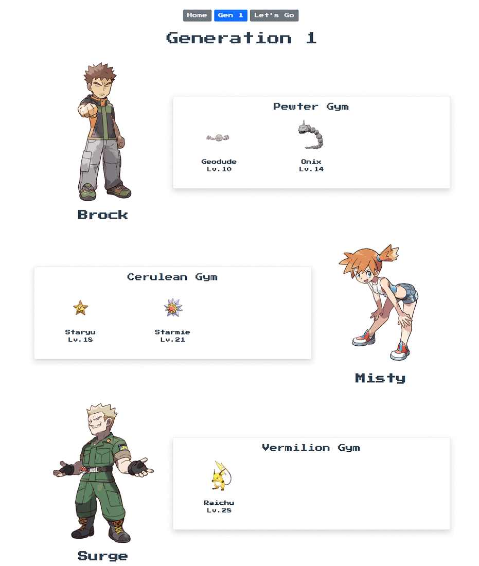
為了要讓版面排版有交錯的效果,使館主與所持有的隊伍左右、右左、左右的方式交互排列。使用 Flexbox 的 order 輕鬆達成。讓道館主的 Html Tag 加上 Dynamic CSS,判斷目前 v-for 的 index,來達到交錯的效果。
此外搭配 Bootstrap 的 RWD breakpoints 只又在 medium 以上才顯示交錯效果,否則在寬度小的裝置上,不會是左右排列,故不需要交錯的顯示方式。
<template v-for="(leader, index) in leadersData" :key="leader">
<div class="row mb-5 align-items-center p-3">
    <div class="col-md-4" :class="{ 'order-md-1': index % 2 === 1}">
        ...
    </div>
    <div class="col-11 col-md-8 border shadow pb-5 m-auto rounded-3">
        ...
    </div>
</div>
</template>
Vue Components
隨著專案的規模增加,利用 Componenets 的方式切割關注點,會讓開發與維護更為方便。但實際在使用 Components 的時候卡 Bug 一小段時間,特此筆記。
Components 使用 objects 而非 array
因為 Componenets 是必須註冊於 Root Element 上,所以是以物件的形式進行註冊,物件的內容包含 Template, Props 等資訊。
import LeaderPokeBoxes from '../components/LeaderPokeBoxes'

// ✔️
export default {
    name: "Generation1",
    components: { LeaderPokeBoxes },
}

// ❌
export default {
    name: "Generation1",
    components: [ LeaderPokeBoxes ],
}
將資料傳入 Componenets
<template>
  <h1 class="mb-5">Generation 1</h1>
  <LeaderPokeBoxes :leadersData="leaders['Gen1']"/>
</template>
Props 轉 data
Props 可以直接再 Compoenents 的資料中使用,不需要透過 Data function,但如果要轉換,必須搭配 This 使用。
Componenets\LeaderPokeBoxes.vue
<template v-for="(leader, index) in leadersData" :key="leader">
<div class="row mb-5 align-items-center p-3">
    <div class="col-md-4" :class="{ 'order-md-1': index % 2 === 1}">
        ...
    </div>
    <div class="col-11 col-md-8 border shadow pb-5 mx-auto rounded-3">
        ...
    </div>
</div>
</template>
export default {
name: 'LeaderPokeBoxes',
props: ['leadersData'],
data() {
return {
dataFromProps: this.leadersData
}
}
}結論:使用 Vue Componenets 先用靜態 Components 再使用 Props 減少除錯時間。
Dynamic Image Src
為了要讓圖片路徑從 Json 當中讀取,並且動態的綁訂在 Image Tag 上,並須使用 Vue Bind 語法,並且再搭配 require function 的方式將資源載入。
但目前有一個問題是,如果圖片檔不存在,會直接讓 Vue CLI 專案無法通過,如果有 Missing Image 的替代圖片讓專案仍可以正常運作會是更好的方式。
<img alt="Gym Leader" :src="require('../assets/' + leader['leader-name'] + '.png')"
 class="gym-leader">
Python Get Images
import requests
import os

headers = {
    'User-Agent': "Mozilla/5.0 (X11; Linux x86_64) AppleWebKit/537.36 (KHTML, like Gecko) Chrome/77.0.3865.90 Safari/537.36"
}

imgBanks = ['https://.../bulbasaur.png',]


os.chdir(r'D:\pokes')

for url in imgBanks:
  img = requests.get(url)
  if img.status_code != 200:
      print(url)
  else:
    extension = url.split('.')[-1]
    name = url.split('/')[-1].replace('.png', '')
    with open(f"{name}.{extension}", "wb") as f:
        f.write(img.content)
        f.close()
Bootstrap 5 Layout
利用 container-lg 來達到 RWD 的技巧,因為 container CSS Class 會限制 Div 的最大 Width,來達到左右留白的效果,但在螢幕寬度不足的情況下,不需要這個留白,因此預設 container-fluid 只又當螢幕尺寸達 992 px 以上時,才限制最大寬度。
參考 Boostrap 5 的 Souce,Container 的留白如下
| container size | width | max-width |
|---|---|---|
| sm | 576 | 540 |
| md | 768 | 720 |
| lg | 992 | 960 |
| xl | 1200 | 1140 |
| xxl | 1400 | 1320 |
<div class="container-fluid container-lg">
  ...
</div>
本次的 Layout 核心就是下列的 Html 以及 CSS 組合。每 Row 代表的是一位 Leader,並且用 Col 切割為 4 Col 與 8 Col,但在 Medium 寬度之下的裝置,則是單欄顯示,但是限制 PokeBox 只佔 11 Col 用以達到稍微置中與留白的效果。
最外層的 Row 本身就是 Flex,使用 align-items-center 可以讓 leader-img 與 pokeBoxs 任一方高度較少者置中對齊另一方,預設是 Stretch,另可考慮 Start 或者 End,但本次設計是採用 Center 的方式。
而在 PokeBoxs 上,加上了 shadow 讓整個版面立體起來,並且加上 mx-auto 讓行動裝置等寬度未達 Medium 以 11 Col 顯示時,能夠自動左右 Margin 達到置中效果,以讓 Shadow 效果可以完整呈現。另外使用了 pb-5 來向下內距撐出高度,並使用 rounded-3 來修飾圓角 (Radius) 增加活潑的效果 🙂
PokeBoxes 中採用了 Nested Row 來排版 Poke 的顯示方式,預設是 6 Col,所以行動裝置每列只會顯示兩個 Pokes,但 Large 以上螢幕寬度的裝置則可以顯示三個 Pokes。
<div class="row mb-5 align-items-center p-3">
    <div class="col-md-4" :class="{ 'order-md-1': index % 2 === 1}">
        <img alt="Gym Leader" :src="leader.img" class="gym-leader">
        <h2 class="gym-leader-name">{{ leader['leader-name'] }}</h2>
    </div>
    <div class="col-11 col-md-8 border shadow pb-5 mx-auto rounded-3">
        <div class="gym-name">{{ leader['gym-name'] }}</div>
        <div class="row">
            <div class="col-6 col-lg-4" v-for="poke in leader['pokemons']" :key="poke">
                <img :src="poke.name" class="img-fluid">
                <div class="poke-name">{{ poke.name }}</div>
                <div>Lv.{{ poke.lv }}</div>
            </div>
        </div>
    </div>
</div>