CSS | Bootstrap5 Class Tips (Intranet Low Maintenance Website / 簡易維護網頁範本)
2022-08-01
說明活用 Bootstrap 5 Components 以及 Utilities 創造網頁設計妙用,減少手工 CSS 的負擔 🙂
說明
Overlapping
<div class="position-relative " style="margin: 0px -12px;width: calc(100% + 24px);">
    <div class="overflow-hidden" style="max-height:300px;">
        <img src="./assets/tech-2.jpg" class="w-100 opacity-75">
    </div>
    <div class="department-heading text-white d-none d-lg-block">sdwh.dev</div>
</div>

<div class="container position-relative bg-light py-1 rounded shadow-lg"
    style="top:-50px; width: 95%;max-width: 1920px !important;">
    <h2 class="mt-3 fw-bolder mb-3">最新消息</h2>

    <div class="bg-light p-2 mb-4 rounded-2 border border-danger">
        <h3 class="" style="font-size:20px">部落格最新文章</h3>
        <p class="">
            App_Offline.htm Template 臨時維護網頁範本發佈囉!
        </p>
        <div class="text-end">發佈日期:2022年8月6日 13:05</div>
    </div>
</div> 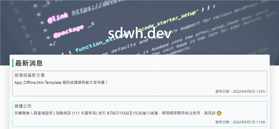
Pattern Background Section
.special-section::before{
    /* https://doodad.dev/pattern-generator */
    background:url("data:image/svg+xml,%3Csvg xmlns='http://www.w3.org/2000/svg' height='100%25' width='100%25'%3E%3Cdefs%3E%3Cpattern id='doodad' width='30' height='30' viewBox='0 0 40 40' patternUnits='userSpaceOnUse' patternTransform=''%3E%3Crect width='100%25' height='100%25' fill='rgba(198, 246, 213,1)'/%3E%3Cpath d='M0 20h6v6h-6zM40 20h6v6h-6zM40 20h6v6h-6z' fill='rgba(246, 224, 94,1)'/%3E%3Cpath d='M20 20h6v6h-6zM60 20h6v6h-6z' fill='rgba(104, 211, 145,1)'/%3E%3C/pattern%3E%3C/defs%3E%3Crect fill='url(%23doodad)' height='200%25' width='200%25'/%3E%3C/svg%3E ");
    opacity: 0.5;
    background-repeat: no-repeat;
    background-size: cover;
    width: 100%;
    height: 100%;
    content: "";
    position: absolute;
    top: 0px;
    left: 0px;
}

.special-section{
    position: relative;
    margin: 0px -12px;
    width: calc(100% + 24px);
}
Flex Autofill
Flex 在排版上十分方便,十分容易做到置中的效果。但如果想要向左對齊,又保有適當的間距則會有困難。
而如果是在三個 Column 的情況下,可以藉由 CSS Pseudo Selector 解決這個問題。
.flex-autofill-3::after {
    content: "";
    flex: 0 0 30%;
}

.little-banner{
    display: flex;
    justify-content: space-between;
    flex-wrap: wrap;
    gap: 1rem !important;
}

.little-banner>div{
    width: 30%;
    max-height: 140px;
    overflow: hidden;
    border-radius: 0.25rem !important;
}<div class="flex-autofill-3 little-banner">
<div>
<img src="./assets/tech-1.jpg" class="w-100">
</div>
<div>
<img src="./assets/tech-2.jpg" class="w-100">
</div>
<div>
<img src="./assets/tech-3.jpg" class="w-100">
</div>
<div>
<img src="./assets/tech-4.jpg" class="w-100">
</div>
<div>
<img src="./assets/tech-5.jpg" class="w-100">
</div>
</div>Icon Hover Effect
.zoom-effect:hover{
    transform: scale(1.2);
    transition: all .5s;
}<div class="d-flex flex-wrap justify-content-between">
<div class="card text-center mb-3" style="width: 30%">
<div class="text-center pt-3">
<img src="./assets/tablericons-lock.svg" class="zoom-effect img-fluid w-50">
</div>
<div class="card-body">
<a href="#faq" class="btn btn-outline-secondary">密碼學</a>
</div>
</div>
<div class="card text-center mb-3" style="width: 30%">
<div class="text-center pt-3">
<a href="https://tablericons.com/" target="_blank">
<img src="./assets/tablericons-computer.svg" class="zoom-effect img-fluid w-50">
</a>
</div>
<div class="card-body">
<a href="#faq" class="btn btn-outline-secondary">計算機組織</a>
</div>
</div>
<div class="card text-center mb-3" style="width: 30%">
<div class="text-center pt-3">
<img src="./assets/tablericons-apps.svg" class="zoom-effect img-fluid w-50">
</div>
<div class="card-body">
<a href="#faq" class="btn btn-outline-secondary">計算機程式設計</a>
</div>
</div>
<div class="card text-center mb-3" style="width: 30%">
<div class="text-center pt-3">
<img src="./assets/tablericons-mouse.svg" class="zoom-effect img-fluid w-50">
</div>
<div class="card-body">
<a href="#faq" class="btn btn-outline-secondary">人機介面</a>
</div>
</div>
<div class="card text-center mb-3" style="width: 30%">
<div class="text-center pt-3">
<img src="./assets/tablericons-wifi.svg" class="zoom-effect img-fluid w-50">
</div>
<div class="card-body">
<a href="#faq" class="btn btn-outline-secondary">網際網路概論</a>
</div>
</div>
<div class="card text-center mb-3" style="width: 30%">
<div class="text-center pt-3">
<img src="./assets/tablericons-doc.svg" class="zoom-effect img-fluid w-50">
</div>
<div class="card-body">
<a href="#faq" class="btn btn-outline-secondary">離散數學</a>
</div>
</div>
</div>Basic Forms
<form class="border p-3 shadow-sm" method="get">
  <div class="mb-3">
    <label for="exampleText1" class="form-label">系統名稱</label>
    <input type="text" class="form-control" id="exampleText1" name="text1">
  </div>

  <div class="mb-3 form-check">
    <input type="checkbox" class="form-check-input" id="exampleCheck1">
    <label class="form-check-label" for="exampleCheck1">新開發系統</label>
  </div>

  <div class="row">
    <div class="mb-3 col-6">
      <label class="form-label" for="exampleSelect1">資通系統分級</label>
      <select class="form-select" aria-label="Default select example" id="exampleSelect1" name="select1">
        <option selected disabled>分級</option>
        <option value="1">普</option>
        <option value="2">中</option>
        <option value="3">高</option>
      </select>
    </div>

    <div class="mb-3 col-6">
      <div>開發方式</div>
      <div class="d-flex align-items-center h-75">
        <div class="form-check form-check-inline">
          <input class="form-check-input" type="radio" name="radioOptions1" id="inlineRadio1" value="option1">
          <label class="form-check-label" for="inlineRadio1">委外開發</label>
        </div>
        <div class="form-check form-check-inline">
          <input class="form-check-input" type="radio" name="radioOptions1" id="inlineRadio2" value="option2">
          <label class="form-check-label" for="inlineRadio2">自行開發</label>
        </div>
      </div>
    </div>
  </div>

  <div class="mb-3">
    <label for="formFile" class="form-label">安全檢測佐證資料</label>
    <input class="form-control" type="file" id="formFile">
  </div>

  <button type="submit" class="btn btn-primary">儲存</button>
</form>
Carousel
<div class="container mb-3">
  <div id="carouselExampleCaptions" class="carousel slide" data-bs-ride="carousel">
    <div class="carousel-indicators">
      <button type="button" data-bs-target="#carouselExampleCaptions" data-bs-slide-to="0" class="active"
        aria-current="true" aria-label="Slide 1"></button>
      <button type="button" data-bs-target="#carouselExampleCaptions" data-bs-slide-to="1"
        aria-label="Slide 2"></button>
      <button type="button" data-bs-target="#carouselExampleCaptions" data-bs-slide-to="2"
        aria-label="Slide 3"></button>
    </div>
    <div class="carousel-inner">
      <div class="carousel-item active" data-bs-interval="2000">
        <div class="overflow-hidden" style="max-height:300px;">
          <img src="./assets/tech-1.jpg" class="d-block w-100">
        </div>
        <div class="carousel-caption d-none d-md-block">
          <h5>創意寫作</h5>
        </div>
      </div>
      <div class="carousel-item" data-bs-interval="2000">
        <div class="overflow-hidden" style="max-height:300px;">
          <img src="./assets/tech-2.jpg" class="d-block w-100">
        </div>
        <div class="carousel-caption d-none d-md-block">
          <h5>資訊系統設計</h5>
        </div>
      </div>
      <div class="carousel-item" data-bs-interval="2000">
        <div class="overflow-hidden" style="max-height:300px;">
          <img src="./assets/tech-3.jpg" class="d-block w-100">
        </div>
        <div class="carousel-caption d-none d-md-block">
          <h5>網路應用</h5>
        </div>
      </div>
    </div>
    <button class="carousel-control-prev" type="button"
      data-bs-target="#carouselExampleCaptions" data-bs-slide="prev">
      <span class="carousel-control-prev-icon" aria-hidden="true"></span>
      <span class="visually-hidden">Previous</span>
    </button>
    <button class="carousel-control-next" type="button"
      data-bs-target="#carouselExampleCaptions" data-bs-slide="next">
      <span class="carousel-control-next-icon" aria-hidden="true"></span>
      <span class="visually-hidden">Next</span>
    </button>
  </div>
</div>
Fat Footer
<footer class="bg-dark">
    <div class="d-none d-sm-flex justify-content-between w-75 mx-auto py-3">
        <div>
            <div class="fw-bolder fatfooter-heading"><a href="#apps">系統開發</a></div>
            <ul class="text-white footer-ul">
                <li>ASP.NET</li>
                <li>Python</li>
                <li>Node.js</li>
            </ul>
        </div>
        <div>
            <div class="fw-bolder fatfooter-heading"><a href="#server">伺服器管理</a></div>
            <ul class="text-white footer-ul">
                <li>Windows Server</li>
                <li>SQL Server</li>
                <li>IIS</li>
            </ul>
        </div>
        <div>
            <div class="fw-bolder fatfooter-heading"><a href="#cyber">資安防護</a></div>
            <ul class="text-white footer-ul">
                <li>PowerShell</li>
                <li>Network</li>
                <li>OS</li>
            </ul>
        </div>
    </div>
    <div class="d-flex justify-content-end">
        <div class="text-start me-md-3 mb-3 mt-3 mt-sm-0">
            <div class="text-white" id="update-datetime">📅 更新日期:2022-08-06</div>
            <div class="text-white">🏢 臺南市東區中華東路三段357巷</div>
            <div class="text-white">📧 [email protected]</div>
        </div>
    </div>
</footer>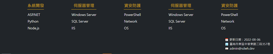
JS
route.js
function UrlRouter(){
    let hash = window.location.hash;
    switch (hash) {
        case '':
        case '#index':
            $('#post-content').load('default.html')
            break;
        default:
            $('#post-content').load(`${hash.replace('#', '')}.html`)
            break;
    }
}

$(window).on('hashchange', function(e){
    setTimeout(function () {
        window.scrollTo({top: 0, behavior: 'instant'});
    }, 100);
    UrlRouter();
});

$(document).ready(function(){
    UrlRouter();
});