CSS | Pseudo Class Image Background
2022-02-17
實驗 Pseudo Class 的使用,不需要新增 html tag 也在視覺呈現上進行設計,本例是探討圖片後置正圓的視覺效果,並比較 Position Absolute 與 Transform Translate 的位移差異。
說明
使用的 HTML
<div class="container">
    <div class="relative img-1">
        <img src="/image/image.png" alt="">
    </div>
</div>
.relative {
position: relative;
border: 2px solid red;
}首先呈現使用 Position Absolute 但不進行任何位移的方式:
width 100% 是以 relative 為相對寬度,而 relative 本身沒有寬度,而會以其中的 img 作為寬度,因此會讓繪製出來的圖形與 img 圖片等寬。
而 padding-bottom 是為圖片設定高度的方式,無法直接用 height 的方式給予高度。
border-raidus 50% 會讓原本的圖形由正方形因為圓弧角而變成正圓形。
將圖形的 position 調整為 absolute,從而圖形才會出現並且會依照 top 與 left 的設定,位移相對於原本的圖片 (img)。
設定 z-index 則是用於決定圖層的順序,讓圖片在上,圖形在下。
.img-1::before {
content: "";
background-color: khaki;
width: 100%;
padding-bottom: 100%;
position: absolute;
border-radius: 50%;
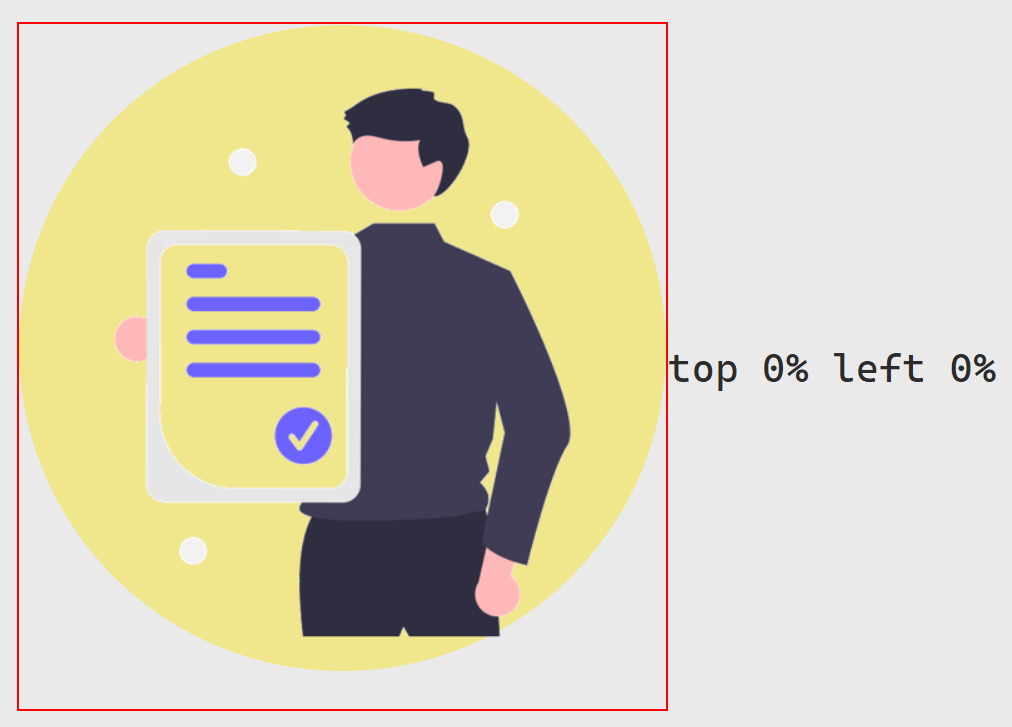
top: 0%;
left:0%;
z-index: -1;
}紅框 border 是沿著圖片本身大小,可以觀察到 width 100% 的圖形,在 top 與 left 都是 0 的情形下,與圖片的關係如何。
.img-2::before {
content: "";
background-color: khaki;
width: 100%;
padding-bottom: 100%;
position: absolute;
border-radius: 50%;
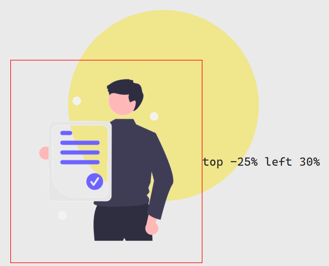
top: -25%;
left:30%;
z-index: -1;
}
Trnaslate
.img-3::before {
content: "";
background-color: khaki;
width: 100%;
padding-bottom: 100%;
position: absolute;
border-radius: 50%;
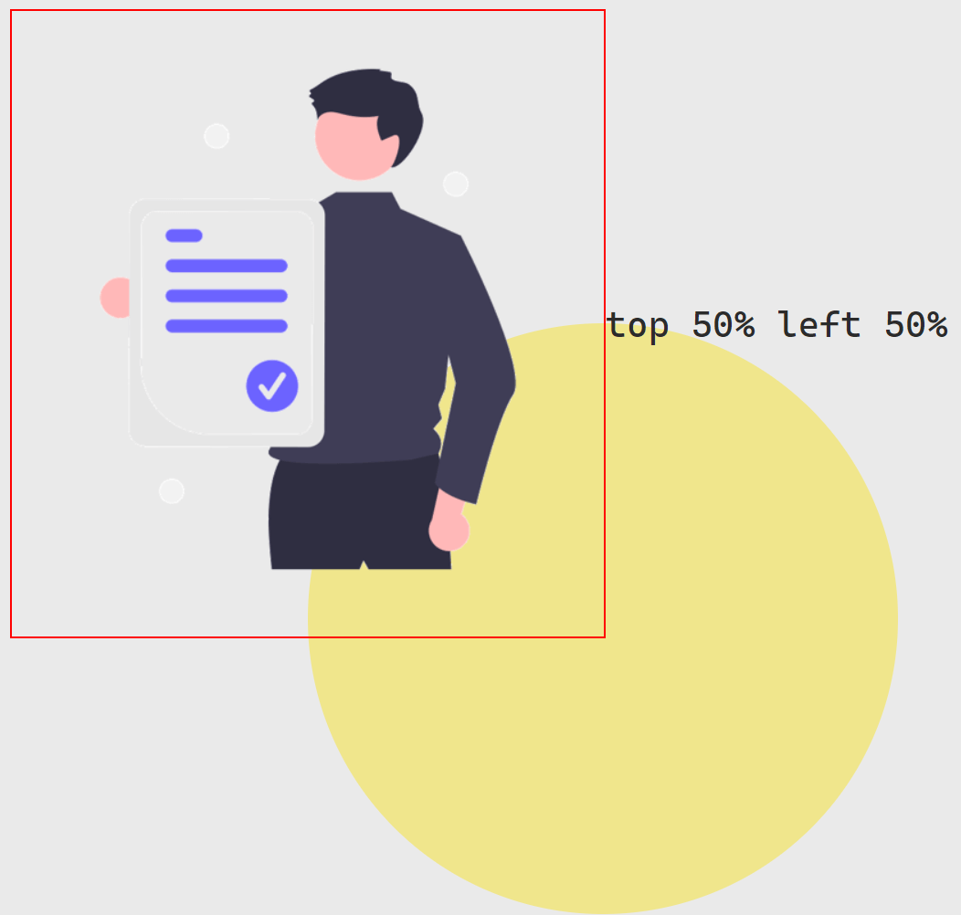
top: 50%;
left:50%;
z-index: -1;
}top 與 left 是參照圖片的高與寬,而因為正是一張長方形的圖片,所以設定 top 與 left 都是 50% 的情況下,距離讓圓心無法正好切在外框的正右下角。
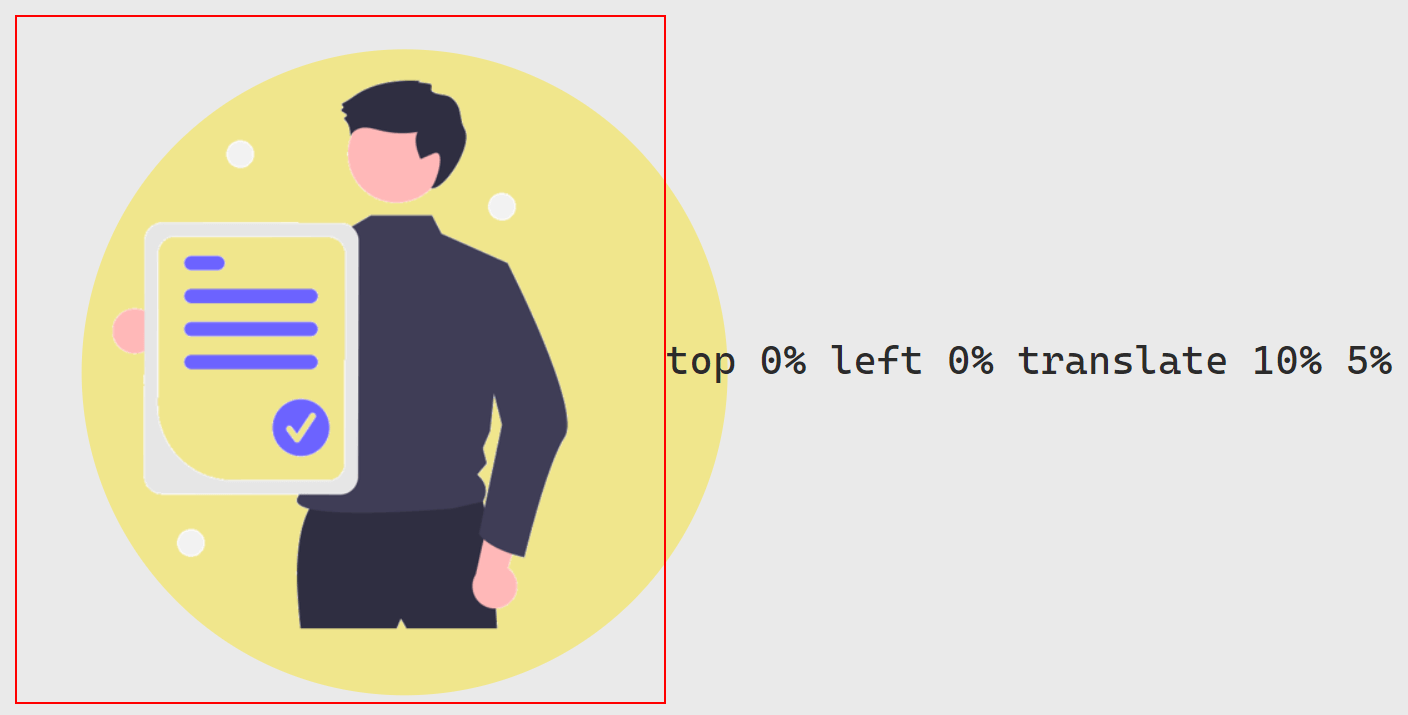
.img-4::before {
    content: "";
    background-color: khaki;
    width: 100%;
    padding-bottom: 100%;
    position: absolute;
    border-radius: 50%;
    top:  0%;
    left: 0%;
    z-index: -1;
    transform: translate(10%, 5%);
}
使用 transform 的 translate 位移是參照圖形本身 (正圓的寬與高),因此若圖形的寬高與圖片不同時,可以根據使用的需求評估要使用 top 與 left 來位移或者是以 transform 的 translate。
| 項目 | 偏移設定 | 意義 |
|---|---|---|
position |
top、left |
依照 圖片 (img) 的寬度與高度 |
transform |
translate(width, height) |
依照 圖形 (content) 的寬度與高度 |
Scale
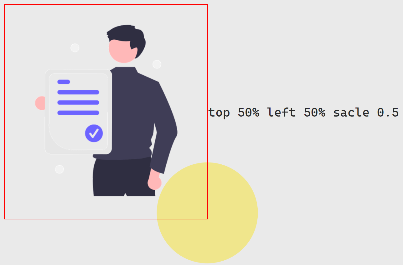
.img-5::before {
    content: "";
    background-color: khaki;
    width: 100%;
    padding-bottom: 100%;
    position: absolute;
    border-radius: 50%;
    top: 50%;
    left:50%;
    z-index: -1;
    transform: scale(.5);
}
如果已經確定圖形相對於圖片的位置 (如 position absolute 搭配 top 與 left 的設定後),縮放圖形的大小就必須要在調整相對距離,但因為寬高不一致的問題,設定起來需要大量的計算。這時可以簡單的使用 transform 的 scale 作為替代,就可以在保持相對位置的情況下,輕易地解決縮放圖形大小的問題。
OverFlow Hidden
<div class="relative img-6 overflow-hidden">
    <img src="/image/image.png" alt="">
</div>
.img-6::before {
content: "";
background-color: khaki;
width: 100%;
padding-bottom: 100%;
position: absolute;
border-radius: 50%;
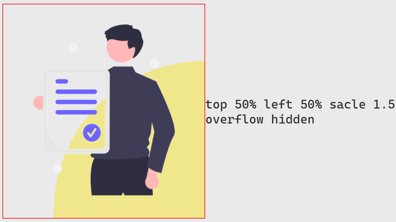
top: 50%;
left:50%;
z-index: -1;
transform: scale(1.5);
}
.overflow-hidden {
overflow: hidden;
}藉由在紅色外框 (Border) 使用 overflow 並設定為 hidden 的方式,可以讓超出外框的部分不顯示,從而達到組合圖層與遮蔽圖層的豐富視覺效果。